Portfolio
FOOD PACKAGING
The main drivers in custom food packaging are keeping the food product fresh for the desired shelf life, preventing the food from being contaminated, and delivering the product efficiently to the end user. Peek Packaging’s decades of experience in designing food packaging will help you determine the best packaging solution for your product. Peek Packaging’s team can help you determine:
- The proper materials needed to keep your product fresh
- The materials needed for different in-store environments like freezers
- The packaging solutions to deliver products effectively
- How your packaging will be compliant with store regulations
Why Does Food Packaging Matter?
Aside from consumer influence, food packaging is important for a number of other reasons. Most importantly, it protects food items from all contaminants — chemical, physical, and biological.
Packaging is also important for preserving the shelf-life of most food items. It also makes it easier and far more hygienic to transport by protecting the integrity of food products. All-in-all, food packaging is crucial to the success of your food brand.
Here are some of the best food packaging options to consider:
Flexible Packaging
This is probably the most popular and versatile form of food packaging on the market today. The beauty of flexible packaging is that it implements multiple layers of film to match the aesthetic with the barrier properties you need to keep products fresh. It can be designed to suit the hygiene, display, and preservation of food items.
This type of packaging ranges from bags and pouches to stick packs and labels. Not only does it suit the food packaging industry, but flexible packaging is popular across a huge range of industries.
Flexible packaging is suitable for a range of foods including:
- Powders
- Creams
- Liquids
- Small items and nearly everything in-between
But before you choose a flexible packaging product, you want to think about how your food item is affected by things such as light, temperature, air, or moisture. For example, if your product does not tolerate air or moisture well, then a foil bag option may be your best packaging choice.
Our Recent Food Packaging Projects
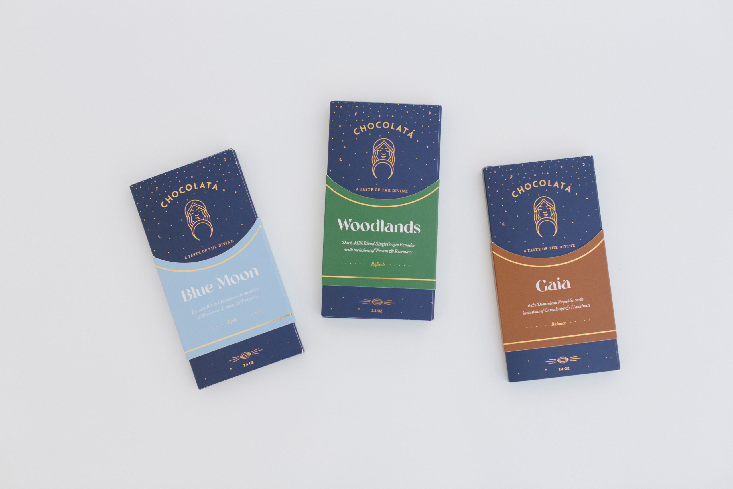
Chocolata came to Peek Packaging looking for a high-end custom packaging solution for their luxury chocolate bars.
For the structural design, we came up with a two part system. The first was an envelope that elegantly holds the chocolate bars. The side flaps of the custom envelope fully overlap to ensure security of the chocolates and allow for more space for graphic design. A sleeve was designed that slides down over the envelope to lock it closed. The sleeves have a tab in the back that slides into a small
slit in the envelope to ensure that every sleeve sits on the sleeve at the exact same height.
All of the custom envelopes were custom printed as one design to create brand consistency and save cost. The artwork was designed with two blue PMS colors. A gold foil stamp was used to embellish the artwork with a luster that contrasts beautifully off the matte blue color. The background of the artwork has gold stars and moons to give the appearance of a night sky. The sleeves were designed with unique artwork to differentiate each flavor.
Each sleeve uses a different PMS color as the background, but they use the same gold foil stamp for a cohesive design that synergizes as a complete unit.
Some of these additional features, such as printing both sides of the envelope and the gold foil stamp, add cost to the package. High-end custom packaging can make customers have a higher perceived value of your product. It's these decisions that help your brand stand out and elevate from the competition.
Give Peek Packaging a call if you would like to discuss custom packaging solutions for your product! (760) 438-1616.
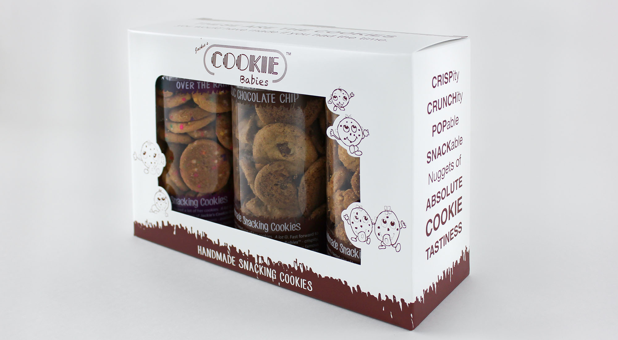
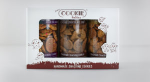
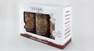
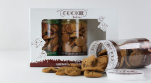
Cookie Babies came to us with a 3 pack product box that could use some improvements. We really liked their box style and graphics, especially the front panel which had a very large window allowing customers to get a very good look at the product. To enhance this look, our team modified the rectangular window to have custom shapes for their cookie baby characters to fit into. This helped bring their branding to life while drawing more attention to the product inside the window. Their logo was prominently displayed above the window. The minimal amount of additional content on the front panel keeps the attention on what matters: the product and the brand. One side panel had catchy phrases to describe their product, while the other side shared how the company started. The back panel had a large version of their logo with a call to action to get more information about Cookie Babies. The graphics effectively showed the many sides of their brand while not being too oversaturated with content.
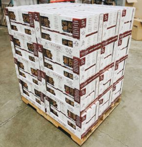
This product also needed a solution to display in Sam’s Club. The box needed to go into a custom tray for a pallet display. Sam’s Club has strict guidelines that customers must follow in order to be eligible to get into the store. Our team used the parameters Sam’s Club provided and worked backwards into a tray size that would work.
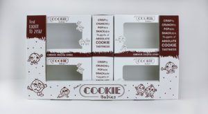
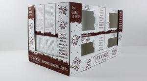
The primary problem that we faced is that the tray was not quite large enough to effectively fit onto the pallet without too much underhang. Underhang is when products do not reach the edge of the pallet. To resolve this, we added an extended panel on the back side that rolled over the top of the display and locked into the bottom of the tray. This gave the trays the extra couple inches needed to fit on the pallet while also providing a large, continuous surface to print on. The product boxes were double stacked inside the trays to avoid increasing the height to stay within the guidelines.
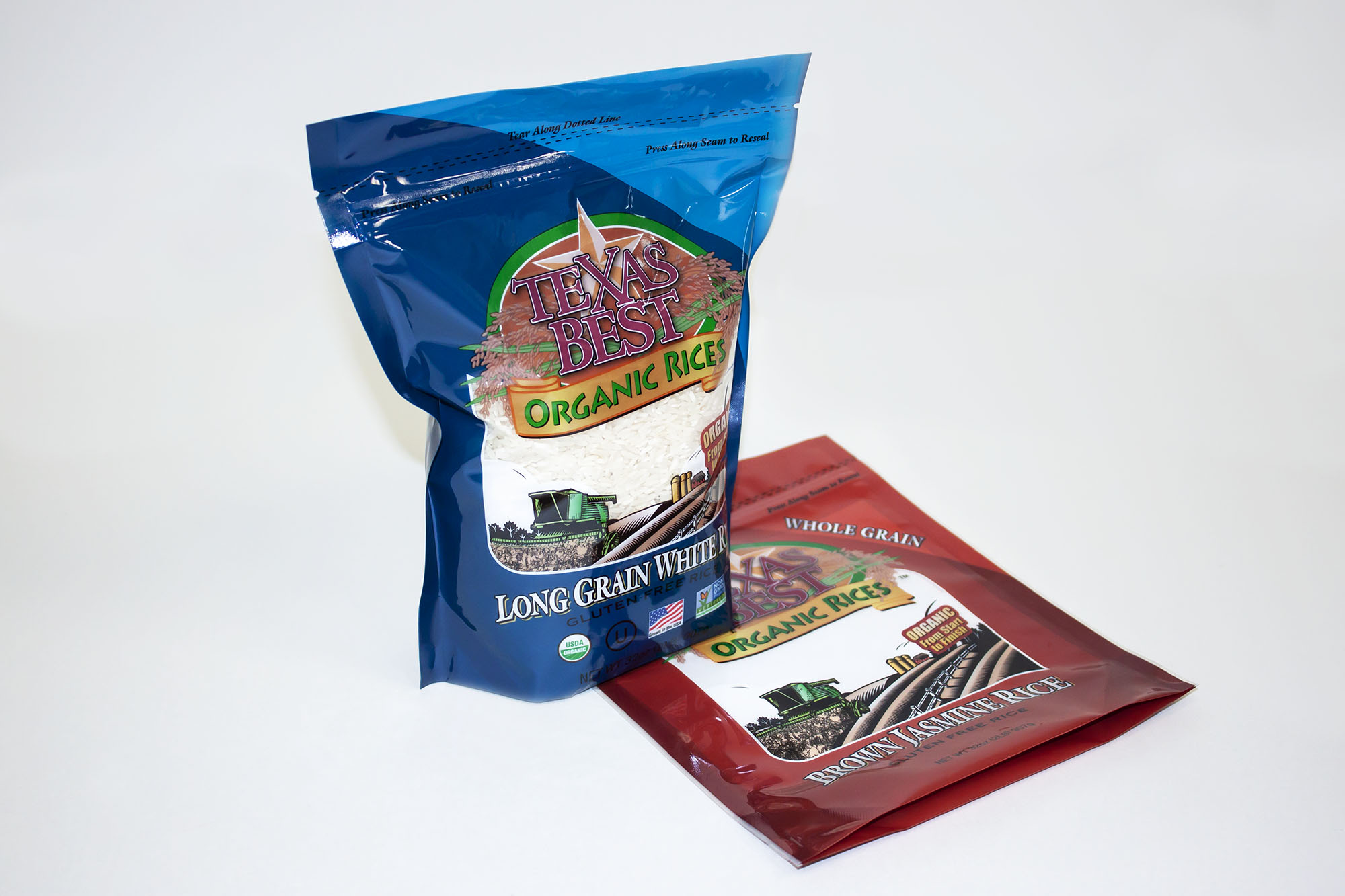
Mckaskle Family Farm’s stand-up pouches were designed for a variety of rice. The custom pouches were designed to display the product inside while keeping the product fresh. A clear PET material was used to accomplish this. 48gauge PET has a medium-strength barrier that is good for products needing moisture and air to stay out of the pouch. The inside material layer is a food-grade 3.5mil LLDPE to keep the rice from being contaminated from the outside plastic material. Combining these materials gives you a strong pouch that works well against preventing punctures also. This is critical for a pouch that holds small items like rice that can leak large volumes from a small hole.
Any area unprinted with custom graphics became a window to view the product. This level of customization allowed the window to flow naturally with the artwork on the pouch creating a unique look. Each pouch is well designed to easily distinguish between the different products while maintaining strong brand recognition through similar artwork across the product line.
The pouches deliver with three sides sealed and the zipper pre-opened at the top for a quick fill. As the pouch fills, the bottom gusset fills and expands allowing the pouch to stand on its own. Above the zipper there is enough material for an easy heat seal to close the pouches up. The rice pouches are now ready for the shelves!
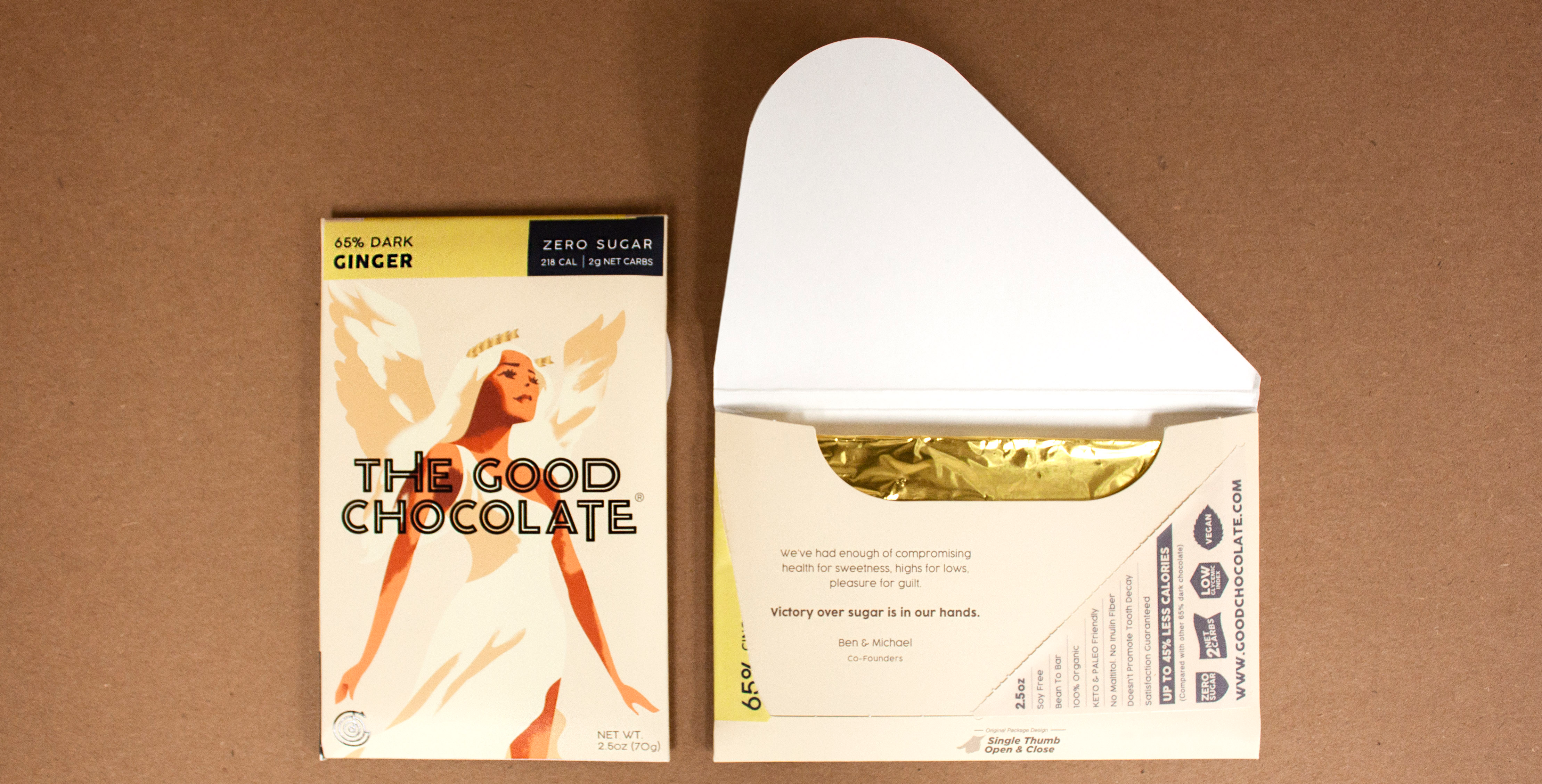
The Good Chocolate Company came to Peek Packaging with a problem many companies face. How do I make a unique packaging solution for a product already in a saturated market? This was the start of our progression to a truly different custom packaging solution for their chocolate bar.
What you typically see in stores today are chocolate bars in a fin sealed pouch loosely put into a countertop display, or a basic box individually packaged. To step out of the norm, we designed a custom chipboard envelope. The chipboard envelope presented 4 problems: shelf life, tamper evidence, clean print surface, and ability to sit upright or lay flat.
Shelf life was the quickest to solve as the chocolate bar can be wrapped in foil which has a very good oxygen and moisture barrier.
A large custom size label with a specialty perforation was designed to seal the envelope shut making it tamper evident. In order to open the package, the customer pulls a tab that is lined up with the perforation to open the envelope. The label also creates a smooth continuous surface for graphics instead of having three different sections to try and line artwork on. As with many innovative ideas, this solution came with some push back from the industry as many people thought it would fail. Some said it was too hard to line up the perforation on the envelope, while others said the label would not effectively keep the envelope shut. Peek Packaging’s ability to create structural samples took the guessing away as extensive testing of different sizes and perforations gave us the confidence to move forward with this unique solution.
The next problem was how to display the product on shelves. An envelope does not have a flat edge so it can not stand upright. It also is slightly bowed so it does not lay flat effectively, and the graphics do not show well in this orientation either. The solution was an angled back display in corrugated material. The angled back allows the envelopes to lean back so they do not fall forward in the display. Corrugated material gave the display the strength to stay upright. Later in development, a kickstand was added to the back of the display to give the display more balance.

